New Lamborghini logo looks more elegant
Automobili Lamborghini, the Italian luxury sports car manufacturer, recently unveiled an updated logo after more than two decades. The decision to update the iconic emblem is driven by a new strategic direction that aims to align the brand’s visual identity with its core values of “bravery”, “unexpected” and “authenticity”. This initiative is part of a broader transformation strategy known as Direzione Cor Tauri, which emphasizes sustainability and decarbonization as fundamental pillars for the company’s future trajectory.
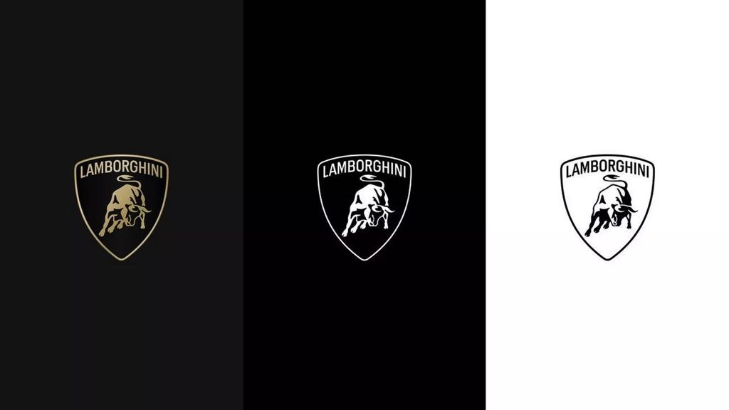
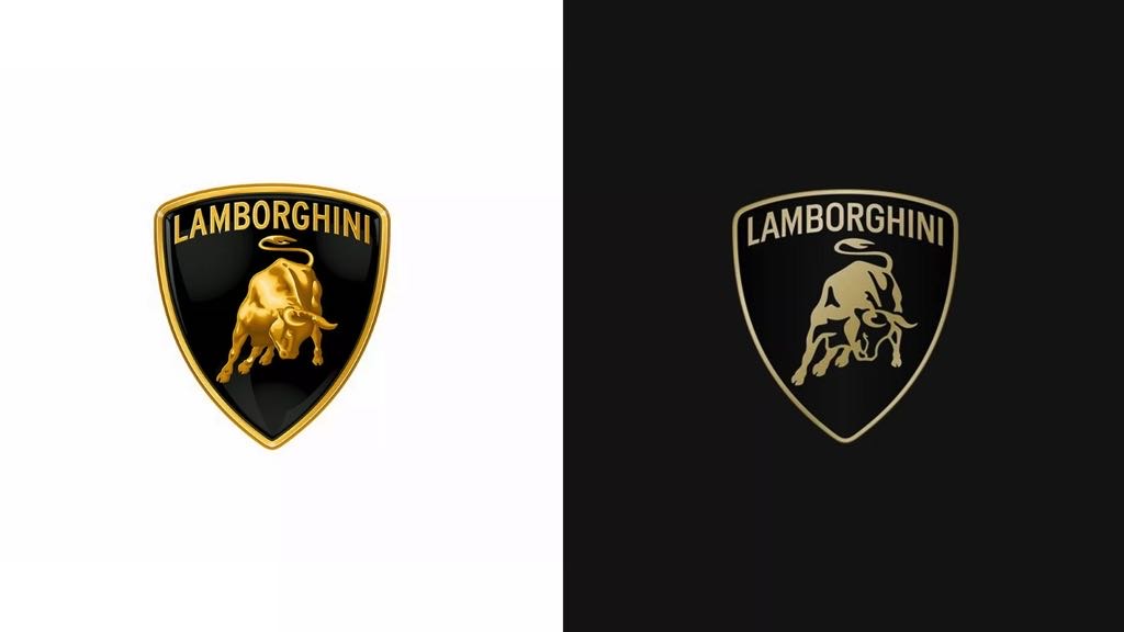
The revamped logo features a wider Lamborghini font compared to its predecessor, accompanied by minimalist yet bold colors. Black and white remain the primary tones, symbolizing the brand’s clear identity, while yellow and gold serve as accent colors, adding vitality and distinction. Notably, the iconic bull emblem synonymous with Lamborghini has undergone a significant transformation. It is now independent on digital platforms, separate from the traditional shield, increasing its visibility and impact.
In addition to the logo, Automobili Lamborghini has introduced an official font inspired by the distinctive design elements of its cars, reflecting the company’s style and ethos. Additionally, a new set of icons, developed in collaboration with Lamborghini Centro Stile, will be uniformly integrated across digital touchpoints, ensuring consistency and coherence in the brand’s representation.
This strategic evolution comes at a time of rapid change, as Automobili Lamborghini looks to the future with a renewed focus on innovation and determination. The redesigned logo not only marks a visual update, but also signifies a broader change in the company’s positioning, aligning with the objectives outlined in the Direzione Cor Tauri program.
By embracing these changes, Lamborghini aims to inspire future generations while remaining true to its legacy of pushing boundaries and challenging conventions. The updated logo serves as a symbol of the brand’s commitment to progress and sustainability, signaling a new chapter in its history.
Do you like the new logo? Let us know in the comments section below.


